
Written from the field by Groovy Hues Painting of Philadelphia — 25 years painting Greater Philadelphia, OSHA 30 · BBB Accredited · PA HIC #PA189587, 5.0 rated across 1,100+ reviews.
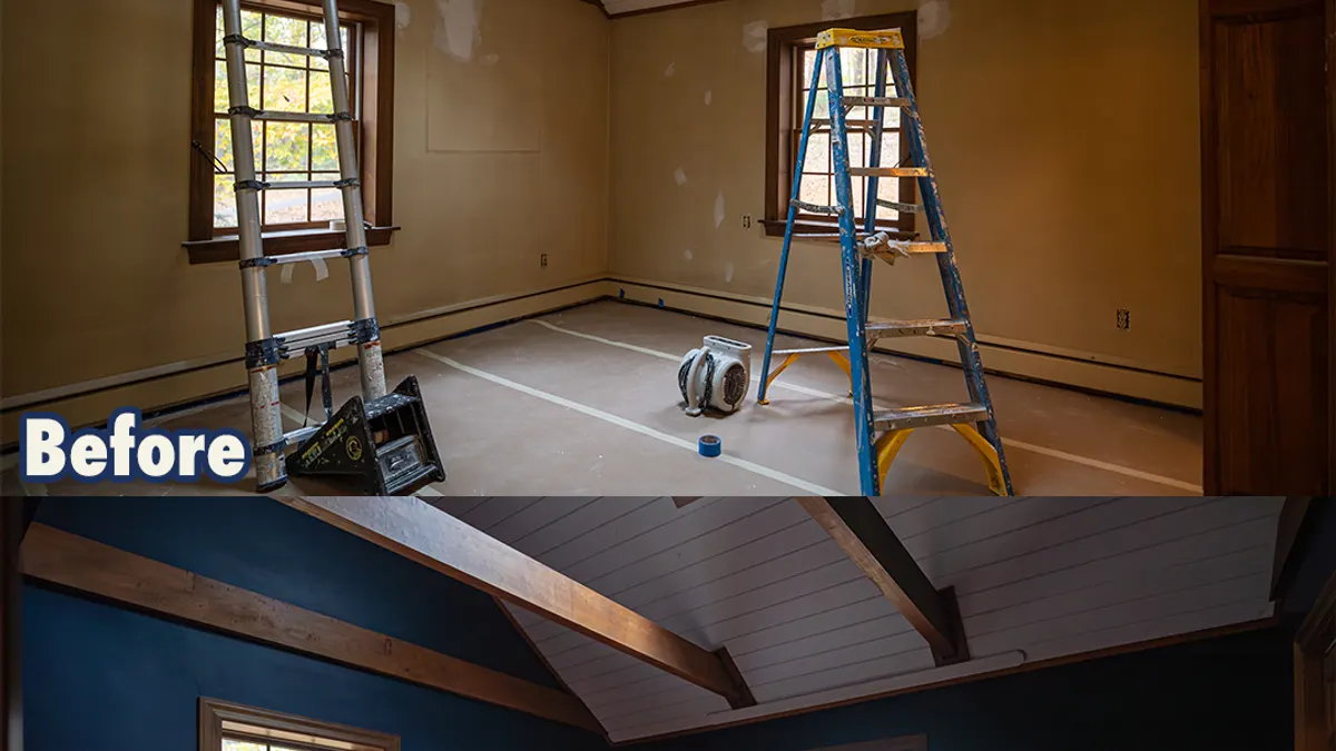
A color that looks perfect on a 2-inch chip can look completely different on your wall — bluer, greener, dingier, or louder. That's not bad luck; it's how color works. Here's the method our color pros use to take the guesswork (and the regret) out of the decision.
Start with the things you can't paint
Your flooring, countertops, tile, and big furniture pieces are fixed. Pull your color from them, not the other way around. The most cohesive rooms have a palette that nods to what's already there.
Understand undertones
Every "neutral" has an undertone hiding underneath. A gray can lean blue, green, or purple; a white can lean warm (creamy) or cool (crisp). Undertones are why two grays that look identical on the chip can clash on the wall. Hold candidates next to each other and against your fixed elements — the odd one out reveals its undertone instantly.
Test in your own light — at three times of day
This is the step almost everyone skips. Light changes color dramatically:
- North-facing rooms get cool, even light that can make colors look flatter and cooler.
- South-facing rooms get warm, bright light that intensifies everything.
- East and west rooms shift hard between morning and evening.
Paint large sample swatches (or use peel-and-stick samples) on at least two walls, and look at them in morning, midday, and evening light — and under your actual bulbs at night. A color you love at noon can turn on you at 8 p.m.
Match the sheen to the room
- Flat/matte: hides wall imperfections; great for ceilings and low-traffic rooms.
- Eggshell/satin: the everyday workhorse — wipeable, forgiving, ideal for living spaces and bedrooms.
- Semi-gloss: durable and scrubbable for trim, doors, and baseboards, kitchens, and baths.
Think about flow, not just rooms
Homes feel calmer when colors relate from room to room. A whole-home color palette — a small family of coordinated colors plus a consistent trim and ceiling color — does this automatically and prevents the "every room is a different experiment" effect.
When to bring in a pro
If you've taped a dozen chips to the wall and you're more confused than when you started, that's exactly what a free color consultation is for. Our color experts read your light, your finishes, and your goals and hand you a palette you can commit to — then our crew brings it to life.
Ready to find your color? Book your consultation or call (267) 467-2640.